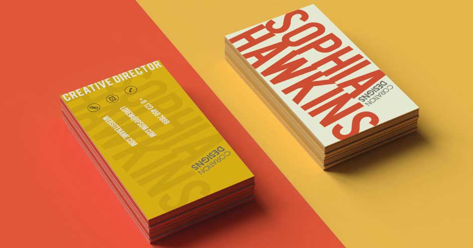
The use of color is a powerful tool for communication. It can evoke emotion, draw attention, and even influence consumer decisions. Choosing the right colors for your business card design is a simple and effective way to promote your brand. The following are some tips for using color psychology in creating high-quality business cards:
Understand Different Colors Evoke Different Emotions
Different colors have distinct associations, which impact how people perceive them. Red is associated with energy, passion, and excitement, while blue is associated with trustworthiness and dependability. Other color associations include:
- Yellow: Yellow promotes happiness and a feeling of well-being.
- Orange: It arouses vigor, persuasion, inspiration, and self-assurance.
- Green: It represents life, health, freshness, friendliness, and respect.
- Pink: It is a feminine color. It has a strong positive pull that draws in emotions like defense, adoration, love, compassion, delicacy, and innocence.
Knowing these associations help guide what kind of message you want to communicate with your card’s design.
Choose Colors That Represent Your Brand
Colors play an important role in representing who you are as a professional or company, so think carefully about what colors best represent your brand identity.
Think about how each color makes you feel and reflects your brand’s values and personality. Green or blue may be better than bright orange or pink if you are in the financial services sector.
Decide what type of image you want to portray — professional, creative, innovative, etc. — and then pick colors that reflect this concept for high-quality business cards.
Consider Cultural Implications
Different cultures have different associations with certain colors; red is often associated with luck in many Asian countries. Be aware of these cultural implications when choosing colors for your business cards, as this could affect how potential customers or partners from a different culture receive them.
Incorporate Subtle Shades
To add depth to your design and make the card look high-end, consider adding subtle shades of color that are slightly darker or lighter than other parts of the design. It will help create visual interest and can also be used to reinforce key points in the card’s message.
Chose Between Muted Tones and Bold Colors
If you want your cards to have a professional look, choose muted tones and pastels over bright or neon colors. Muted tones are more calming and create a sense of sophistication.
For a more eye-catching, whimsical feel, bright or vibrant colors may be better than duller hues. Consider adding them to your design to help draw attention to certain elements on the card, such as logos or contact information.
Keep Color Combinations Simple
Color combinations should remain simple, with no more than three or four main colors on the card. Too many colors can make the card difficult to read and distract from the overall message you’re trying to convey.
Make sure the colors you choose for your business cards look good together and won’t clash. Making sure the colors used in your card design are complementary will create a more appealing and unified look.
Choose High-contrast Colors
Use contrasting colors to make sure the text on your card stands out against the background color. It will make the important information more easily readable and make sure it won’t get lost in a busy design. Using a high-contrast color scheme can help draw attention to key elements of your card, such as contact information and logos.
Be Aware of the Current Trends in Your Industry
Colors that were popular a few years ago may be less fashionable now. Keep up with what’s in style to make sure your card looks current. You can also update your cards as needed as the trends change.
Get High-Quality Business Cards for Your Enterprise Today
Using colors is a great way to set the tone for your business cards. Color psychology is based on the idea that certain colors create feelings and emotions in people viewing them. Understanding the psychological impact of colors helps you create high-quality, effective business cards. Remember to keep an open mind and experiment with different colors until you find the perfect combination. You can also reach out to a business card company for help with colors and design for your company business cards.

